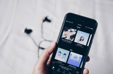
“First impression is the best impression,” you might have come across this quote at least once in your life, which is also why we try to be at our best around important people. Likewise, in podcasting, your show’s cover art, logo, or thumbnail is the first thing that your audience will see along with the title. So, having a captivating and catchy podcast cover is important to get more visibility. And this guide is all about it; how to create a podcast cover art with a proper size guide, logo, and dimensions, and one which is captivating.
Quick Links
- Why Do You Need a Podcast Cover Art Guide – From Logos to Dimensions?
- Podcast Cover Art Dimensions | A Helpful Guide
- More Things on Your Guide to Consider While Creating Your Podcast Cover Art
- 1. File Format
- 2. High Resolution
- 3. Say Out Your Podcast Loud and Clear
- 4. Minimalism is Better
- 5. Use your Picture
- 6. Pick the Right Colors or Use White instead
- 7. Fonts and Weights
- 8. What the Logo
- 9. Keep Your Words Short – It’s Your Podcast, Not a D
- 10. Look at the Competition
- 11. Risk is All it Takes – Have Fun with Designing
- Frequently Asked Questions [FAQs]
- Wrapping up: Podcast Cover Art Guide
Also Read: 8 Best Habit Tracker Apps for Android and iPhone
Why Do You Need a Podcast Cover Art Guide – From Logos to Dimensions?
Usually, a lot of people think less about podcast covers; half of the dying podcasts I see on platforms like Spotify have a dull cover, and some don’t have one at all. Maybe because they did not upload one, or the cover art did not have a proper dimension.
While you can always choose a pre-made template from design apps for creating your podcast, those who create from scratch can often mess up the size. We will discuss the proper size or dimensions in the following section, but before that, if you want to save your time creating stunning podcast covers, you can check out my list of the best apps to create podcast cover art or template. I am pretty sure you will be amazed by the creatives these apps have to offer.
Having a proper dimension for your podcast logo or cover is also important, as most podcast platforms strictly follow a standard size for the cover art. If your podcast cover has no proper dimension, it will probably not be accepted or shown on most apps like Apple Podcasts, Spotify, and more. Besides, a podcast show with no cover art is a big downside and a common reason for audiences to skip the show.
While there are standard dimensions for the cover art, a few platforms might have their own requirements. So, it is always good to give check on such aspects of your favorite platforms before submitting your show on them.
Also Read: Podcast Name Generators: How to Pick a Name and Tools
Podcast Cover Art Dimensions | A Helpful Guide
As I have already mentioned in the above section, platforms can have their own requirements when it comes to podcast cover art. But thankfully, there are also standard sizes or dimensions that are more commonly used in almost all the popular podcasting platforms. Among these, Apple Podcasts and Spotify strictly have a certain notion of how your podcast cover art should be in dimensions and what you should and shouldn’t do. Thankfully, most podcast platforms have the same requirements, and you can consider them as standard.
Let’s save you some time and list out the standard dimensions for creating podcast cover art.
| Minimum dimensions | 1400 x 1400 pixels |
| Maximum dimensions | 3000 x 3000 pixels |
| Color Space and DPI | RGB, 72 DPI |
| Aspect ratio | 1:1 (square) |
| File Format | JPEG/JPG or PNG file |
These dimensions are considered to be the standard size options and are widely supported by podcast platforms like Apple Podcasts, Spotify, Google Podcasts, and more. However, as said earlier, podcasting platforms can also have their own specific requirements and recommendations related to the size and dimensions of your podcast cover. So it is always best to check the requirements of your favorite podcast platform before you start creating your podcast cover art.
Your Audience is Yawning
There are two things that can make your audience sleepy while listening to your podcast. One is a boring script, and the second is poor audio.
Here are my favorite 10 best microphones for podcasters that will make you sound-sick professional. And also budget-friendly for beginners and professionals.
More Things on Your Guide to Consider While Creating Your Podcast Cover Art
Here are a few additional considerations for your podcast cover art:
1. File Format
The foremost requirement is the design format of your podcast cover art. Of course, you cannot use an MP4 or Gif format on your podcast covers yet, but the two most common file formats are JPEG/JPG and PNG files. These extensions are used with images, and each of them uses different types of compression and image processing to store those pixels.
JPEG/JPG has a good quality image format with a lesser file size, while PNG has a better quality image format with a bigger file size. Now, both options are great as they showcase good-quality design artwork on your podcast, but there is definitely a catch.
JPG is a smart option if you are using a self-hosted website to showcase your podcast. This will save you a lot of web server resources, but if you are using podcasting hosting, PNG should be your choice, as PNG images have much better quality, and a bigger file size should not be an issue. Alongside, always note if the podcast hosting platform has its own specification for the size, and if your image size is larger, you can use a tool like reduce images and compressing the size without compromising much on the quality.
Also Read: Podcast Script: Tips, Templates, and More
2. High Resolution
A high-resolution design art is crucial for your podcast show, as all the different platforms have their own way of compressing the file, and there are different screen resolutions with different devices, such as podcasts on Apple Watch, iPhone or iPad, Android phones, tablets, or even a personal computer or laptops like Windows, Mac, or Linux.
So it gets more important to ensure your podcast cover art has a higher resolution so resizing for multiple devices is easier without losing the design quality.
Also Read: Podcast RSS Feed: Everything You Need to Know
3. Say Out Your Podcast Loud and Clear
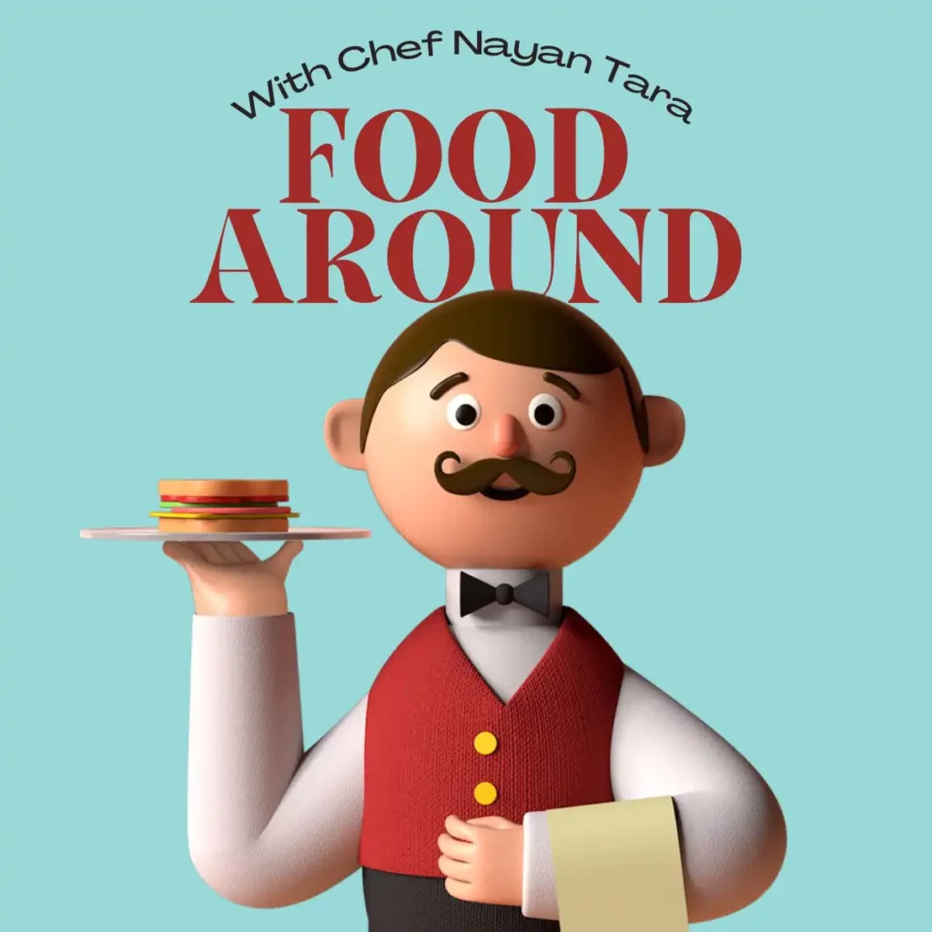
When it comes to a podcast cover, we often want to create something catchy but, most times, forget to include what the podcast is all about. Our podcast cover should be the one that can give a hint or convey what the podcast is about. For instance, your podcast cover can have a short-tail keyword, show name, and the design to speak more about the theme and not just anything random.
Let’s take sports as an example, and if your podcast is about football, then you can have a minimalist goal post with a ball tracking into it or something similar. There is no stoppage to creativity, but your design should be speaking your theme or goal. It activates the thought and starts building a positive mood toward the show even before the listeners hit the play button.
4. Minimalism is Better
Minimalism is not a new trend, and it has been around for quite a time now. But why do a lot of people find the minimalistic design attractive or eye-catching? It is because the visuals are easy for the eye. When you have a crowded design with a lot of text and elements here and there, the viewer might find the design more difficult to understand. Besides, it would make it hard for them to read your show name or any other important information about it.
Minimalism also makes the elements in your design stand out, there is a good amount of space, and everything looks decluttered and neat. Such things can create a positive or calmness in your audience’s mood and drive them more toward your podcast.
Also Read: Adobe Express vs. Canva | Which is The Best Design Tool?
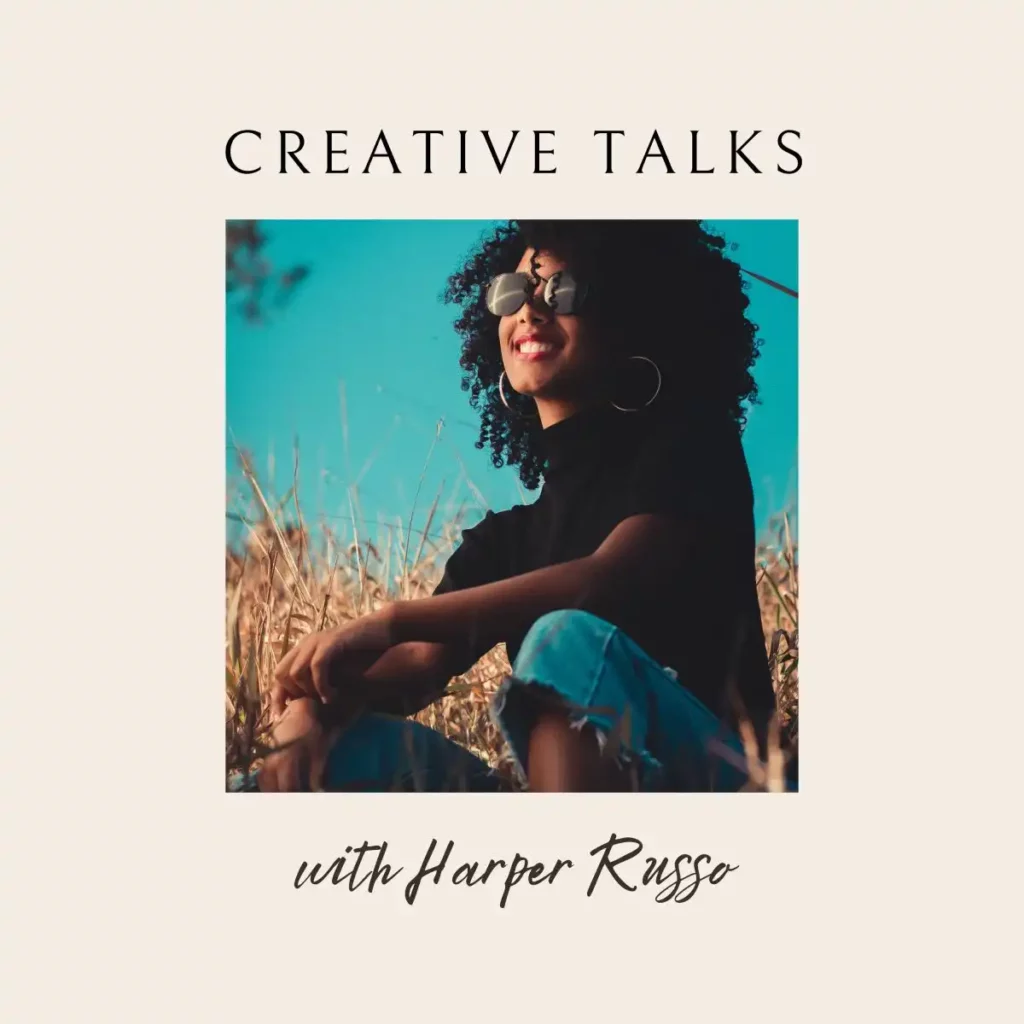
5. Use your Picture
“Genuinely human,” we might now have to keep using this phrase more often. With the help of AI, anyone can create a script and make the AI speak and record a podcast. But that’s so not how podcasting should be. Podcasting helps us connect by sharing our views, we fumble a little, and there is laughter and so much more than just the interaction behind the scenes. And when listening to your podcast, the audience should feel the same even when looking at it.
A podcast cover with your image on it makes it feel more genuine; it gives a sense of connectivity. No one wants to listen to a machine, and with your image on the podcast cover, you can bring the audience confidence that you really are behind the curtains.

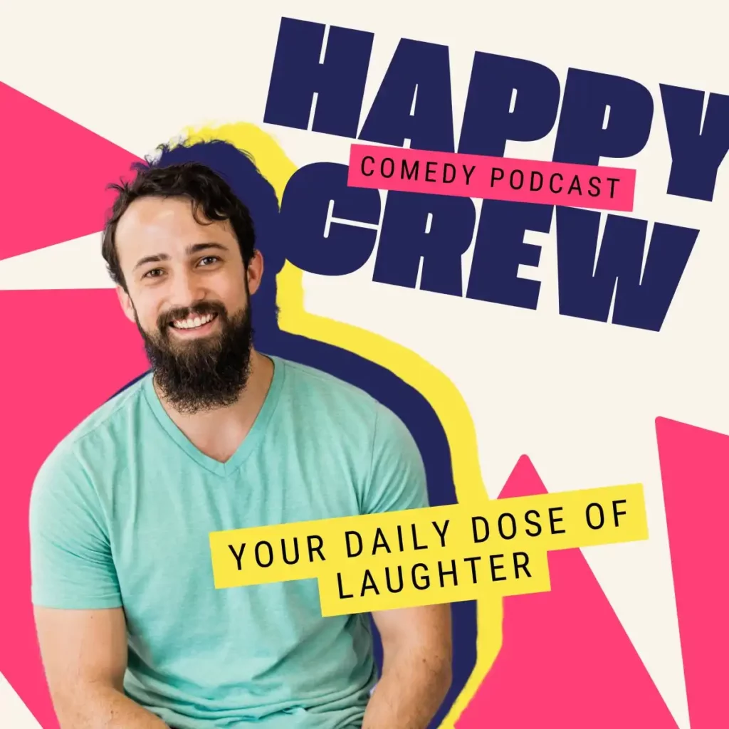
Besides, try using a picture that matches your theme. For instance, if it is a podcast in a comedy genre, you can have all those big laughing pictures on your covers with the guest, or if it is a lot more formal, like education or interviewing, you can keep a smiling face with more formal fits. The reason for this is simple; we want the audience to make that connection even before listening to your podcast.
For pictures, you will have to make some effort and remove the background before using them. If you are using an Apple iPhone with iOS 16 or later, you can just drag yourself from your photos and create a picture with transparent background. Or, you can also use tools like remove bg that gives your pictures a transparent background when you use along.
You can also get a graphic designer and get yourself into a more eye-catchy and decent graphic image and use it as a foreword element of your design.
Also Read: 9 Productivity Apps for MacBook That Are a Must Have
6. Pick the Right Colors or Use White instead
Choosing the right colors in your design is a big advantage, and color psychology actually works very well in the real world. Now, this is for both the foreword text, which is the main element of your design, and the background color.
Firstly, let’s do the background colors. In the background, you can choose to have lighter or pastel colors, as they are the cover for most of your design. Having a dark color on your podcast cover’s background is also a good option, but I would keep choosing only certain colors like purple among the dark to give that contrasting look. You can find such colors and play along with them; test them out to see if they really match your show’s theme, do your design needs to be too vibrant or saturated, and then pick a suitable color.
Secondly, dark colors need to be well-thought before using them; they can be too shiny to the eyes, and if you plan to use black, remember the apps are now also introducing a dark background which might just gulp a lot of your design in reality, and you will be left only with the foreword text element or the graphic or image you use with it.
Secondly, the foreground text, graphic or picture color, which shall be the top layer of your design, should give a contrasting effect to the background color. For example, I would any day choose to use black color text on a yellow or white background or white text on a dark background like purple. Do the same with the graphic or other foreground elements in your design and have a contrasting look. This also improves readability and creates a line between the background and foreground elements.
Also Read: How to Move from Blogger to WordPress? A Handy Guide
7. Fonts and Weights
Typography is another important element of your design that can either shine your visuals or lead them to failure. Let me be more specific about why typography matters the most when it comes to designing your podcast cover art, and it is not only about the logo but also the other text elements in your design.
Here are some why’s,
- Font helps you establish a visual identity for your design in terms of branding. The choice of font can help you showcase the case and its simplicity and leave a style statement. A lot of novice users end up using funky typography that nowhere matches the theme of your show and can make your design look lousy.
- The font style says a lot and not just how visually appealing they are. For example, serif fonts can give a traditional, elegant, or formal feel, while sans-serif fonts often convey a modern, clean, or informal tone. Script fonts may evoke a sense of creativity or personal touch. The choice of font can shape how viewers perceive and emotionally connect with the design.
- Choosing the right font and weight impacts text readability. Factors like letterforms, spacing, and stroke width improve user experience and reduce difficulty in understanding the text on your podcast cover.
- Typography can improve the look of your design. Use different fonts that work well together to make it stand out. Try combining fonts with different weights for contrast and balance. This makes your design more impactful.
Of course, any podcaster would like to establish their show as a business or a brand with a more consistent audience that finds the show each time without any difficulty. From the same point of view, typography can help you establish better brand consistency, and when you have multiple shows, it is easier for them to identify the genuine ones; it is a crucial factor alongside a logo as both of these elements in your podcast cover art will give a brand identity.
Also Read: Your Android Phone is Charging Slow? Here is What We Did to Solve it
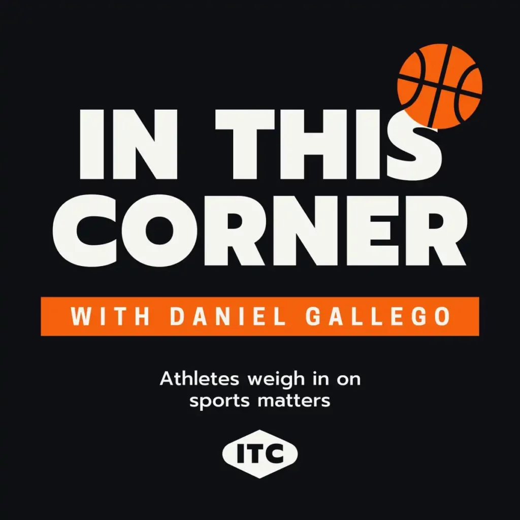
8. What the Logo
A lot of users skip using a logo when designing a podcast cover art, and through this guide, I request you to stop making that mistake. A logo makes your podcast credible and gives it a visual identity making it recognizable despite the platform.
For example, if you have a podcast show and wish to promote it on multiple platforms with different cover designs, it would be hard for your audience to do that without a recognizable logo. Also, there are instances when other podcasters might accidentally have a similar title for their show, and your audience may end up confused. A logo can help them quickly recognize your show, be it on any platform.
Logos also add credibility to your show, but only when there is a single consistent logo on all your podcast covers. With credibility, your show can also open up to sponsorships, businesses, and more kinds of advertisements which is a great way to monetize while connecting your thoughts with the audience.
But a lot of creative podcasters have a huge difficulty in designing a logo for their show. Some hire a professional designer, which costs them a good amount of their savings, while some try doing it on their own. I, too, prefer the second option, like most users reading this guide, and to make it easier, I use professional tools that save me a lot of creativity towards my show rather than designing. Here are the Best Logo Maker Apps I use on my iPhone and iPad to create stunning logo designs. Besides, most of them are also available for Android and browser-based devices, so you won’t have to find their alternatives and save time for the next segments of your podcast dream.
Also Read: Dell U2723QE Ultrasharp 4K KVM Monitor Review
9. Keep Your Words Short – It’s Your Podcast, Not a D
Logo, font, images, background and foreground color, and graphics are for sure important elements of your podcast cover design. But there is more thing that can set up your podcast cover to failure if not done right.
It’s the text on your podcast cover.
In the third point of this helpful guide, I insisted you use your words loud and clear, but also a hint about using short-tail keywords. Of course, your podcast cover should depict the theme of your show but wait, you aren’t going to write long texts about it in your design, 99% of people won’t read it, and your design might just look awful.
More often, the text on your podcast cover is the title of your show, so try and use your words more carefully. We need a text with limited words; after all, it’s your podcast show, not a dinosaur like the Trex.
Listeners will glance at your podcast in less than 2 seconds, and either will start listening to it or skip it. Your podcast cover design is all about hooking your audience in those 2 seconds. And long words are of no help in this case; most users might not spend their crucial time reading it. Rather short, captivating, and easy words, as your show title or text on your podcast cover will do a great job.
10. Look at the Competition
Most users mistake “Look at the competition” for copying them. No, it’s clearly not that.
When designing your podcast cover, you can often have a design block and run out of inspiration. In such times, go to your favorite podcast platform, use the search option, and look for a podcast genre similar to yours. Now, look for the shows that are doing really well and topping the charts; what different are they doing with their podcast cover, which gives their audience a hook or attraction?
You can then try something similar but not exactly the same. Your competition should inspire you to do better, and this can help you solve your design block.
Also Read: Best Clipboard Managers for Mac | Cut-Copy-Paste Smartly
11. Risk is All it Takes – Have Fun with Designing
Designing your podcast is a serious business, but that nowhere means you cannot take risks in designing. If you are a good creative thinker, you can always go out of the box and take risks in your podcast cover, try something new and fun that can depict all the traits and themes of your show, and be relevant.
Get opinions about the design from credible users, and if most of them find the design to be creative and fun, you can always use it. It’s your show, and ultimately, it should be a reflection of your thoughts and views, including the title and cover design. But there are a few things you cannot mess up with, such as aspect ratio, podcast cover dimensions, and more.
Also Read: 8 Best Blur Background Apps for Photos on Android and iPhone
Frequently Asked Questions [FAQs]
Your podcast cover art can have a minimum of 1400 x 1400px cover size and a maximum of 3000 x 3000 px size. Or you can also design your podcast cover art in terms of aspect ratio, which is 1:1 in size.
It depends on what platform you use for hosting your podcast, but for most podcast platforms, 30 MB or close to it is an ideal file size for a podcast cover.
There are a couple of options, such as Adobe Express, Canva, Desygner, VistaCreate, and more, that can help you create captivating podcast cover art. You can check out these best apps for podcast cover art for more.
You can either have a PNG or JPEG/JPG file for your podcast cover art, and these file types have different compression algorithms that can either give you a crisp quality with a bigger size or better quality with a smaller file size.
The podcast cover art ratio is 1:1, which is also known to be a perfect square. This aspect ratio is used on many platforms, too, for instance, social platforms like Instagram, Facebook, and more.
Wrapping up: Podcast Cover Art Guide
This pretty much sums up our guide on how to design a podcast cover art using appropriate size/dimensions, logo, typography, file format, and more. You can check out more helpful guides on podcasts on our website – Tiny Quip, and bring the best for your next show.
Build a WordPress Website for Your Podcast Audience with Kinsta
Be it redirecting your audience to your e-commerce store, making them read your blogs, or creating a whole new community. Do it all with managed WordPress on Kinsta.
- High-performance CDN
- Google’s cloud servers
- Reduce load times by almost 49% (TTFB, cache, and more)
- Site backups and uptime checks
- Free SSL certificates
If you like this article, do give this a quick share on your social media handles and do tag us. Also, join our Telegram channel, Facebook page, and Twitter to never miss a quick update.